

Consulting Company
Leader Demo
Restaurant Menu
Leader SVG Demo
Candy Shop
Third Party Cart Integration Demo
You May Also Like
Electronic Store
Slider With Attributes and Lightbox Demo
VPS Servers
Filter and Attributes Slider Demo
Summer Vacation
Teaser Card Element Styling Demo

Teaser Card
-
Joomla! 5 support
-
link aria-label filed
-
image title field
-
image loading eager option
-
align image without padding in left and right position
-
code optimization
-
removed input fields submit delay
-
minimum PHP version requirement: 7.4
-
minimum Joomla! version requirement: 3.10
-
minimum WordPress version requirement: 6.0
-
minimum YOOtheme Pro version requirement: 3.0
hovered image width
-
Hover Images
-
Items and Nested items modals can load any content with #hash or url#hash
-
Items limit output
-
HTML Element for Meta Field
-
button 'uk-toggle' attribute not working
Set active filter with URL hash
-
Title show/hide option
-
Button text Color
-
Custom link attributes not working when panel link/custom panel link is enabled
-
element margin: Keep Existing -> Default
- Star Rating
-
Filter Nav: option to hide dropdown after click
-
Price in Leader style mobile breakpoints
-
Removed Text Hovering Effect When Panel Link is Enabled
-
Filter and Element Slider can be used at the same time
- Filter Nav: New styles — dropdown and toggle
- Modal window issue when section animation is enabled
- Modal content html tags stripped when panel link is enabled
- Lightbox Gallery Support
- Nested Slider for the item attributes
- Custom Panel Link
- Grid Stack
-
Item Visibility
-
Image Align: Between
-
Attributes Position: Above Title
-
Attributes block align
-
Modal option to show item image
-
Leader Grid breakpoints
-
Code Optimization
Button Position: Align Bottom with image align is set to left or right
-
Joomla 4 Support (Version still the same. To install just Download again updated Extension)
-
Item: Added Support for Image Attributes Tags, with Dynamic Content Mapping Feature
-
Item: Added Support for Link Attributes Tags, with Dynamic Content Mapping Feature
-
Link Settings: Option to align item buttons to the bottom
-
Visibility options for meta text, content, label, image, button, attributes and attributes images.
-
Filter Option: Disable Sorting
-
Slider Grid: More Slider Width Sizes for Phone Portrait Breakpoint
-
Columns settings: "uk-width-expand" Option for Element Items & Attributes
-
Image Settings: Option to set image attribute decoding="async"
-
limit output for title & meta text
-
option to remove HTML markup from title and meta text
-
Button Option: Align Override
-
Optimised Conditional Logic For Link Section
-
Item Settings: Added Support for Attributes Tags with Dynamic Content Mapping Feature
-
Attributes Settings: Added Support for ID`s, Classes and Attributes Tags with Dynamic Content Mapping Feature
-
Element Settings: Disable Force Filter Nav Alphabetical Sorting
-
Joomla & Wordpress Plugin
-
Custom Item Styling
- Teaser Card Styling Demonstration Examples
-
Item Settings: Panel Style — "Custom"
-
Item Settings: Panel Border
-
Item Settings: Panel Border Size
-
Item Settings: Panel Border Type
-
Item Settings: Panel Border Color
-
Item Settings: Panel Border Radius
-
Item Settings: Panel Text Color — "Light, Dark, Selected Color, Custom"
-
Item Settings: Master Color
-
Item Settings: Title Color Override
-
Item Settings: Meta Color Override
-
Item Settings: Content Color Override
-
Item Settings: Icon Color Override
-
Item Settings: Price Color Override
-
Item Settings: Price Currency Symbol Color Override
-
Item Settings: Old Price Color Override
-
Item Settings: Old Price Currency Symbol Color Override
-
Item Settings: Attributes Text Color Override
-
Item Settings: Attributes Icon Color Override
-
Item Settings: Button Style Override
-
Item Settings: Button New Style — "Custom"
-
Item Settings: Button Custom/Circle Background Color Override
-
Item Settings: Button Custom Text Color Override
-
Item Settings: Button Custom/Circle Button Border Radius Override
-
Item Settings: Button Custom/Circle Border Show/Hide"
-
Item Settings: Button Custom/Circle Border Size Override
-
Item Settings: Button Custom/Circle Border Style Override
-
Item Settings: Item Button Circle Icon Color Override
-
Item Settings: Custom ID
-
Item Settings: Custom Class
-
Item: Custom Attribute Icon Color
-
Element Option: Button Circle Border Size
-
Element Option: Button Circle Border Style
-
Element Option: Button Circle Border Color
-
Element Option: Button Circle Custom Icon Color
-
Element Option: Old Price Currency Symbol — "Show/Hide"
-
Element Option: Old Price Currency Symbol Text Size
-
Element Option: Old Price Currency Symbol Text Color
-
Element Option: Old Price Currency Symbol Text Position
-
Element Option: Old Price Currency Symbol Vertical Align
-
Element Option: Below Content Price Position
-
Item: Attributes Icon Color Overrides
-
Fixed: Element: Panel Link
- Falang Support
-
Option: Content Force Alignment Left
-
Option: Content Drop Cap
-
Option: Content Columns
-
Option: Content Columns Breakpoint
-
Option: Content Show/Hide on modal link enabled
-
Option: Content Remove HTML markup (Modal still display html markup)
-
Option: Custom Label Color
-
Option: Old Price Line Through Decoration Enable/Disable
-
Characters Limit for Content Field
-
Option: Filter Animations
-
Option: Item Animation
-
Item Panel Style Override
-
Item Image Transition With Modal Enabled
-
Missing Vars Notices
-
Code Improvements And Fixes
-
Modal Support
-
Option: Display Item Content in Modal (Candy Shop Demo)
-
Option: Display Attributes Content In Modal (Top Donators Demo)
-
Option: uk-toggle link attribute
-
Option: Panel Link Removed and sets to false by default
-
Code Improvements And Fixes
-
Attributes Grid
-
Attributes Image & icon Support
-
Added Dedicated Attributes Settings Tab
-
Grid Option: Override Phone Portrait Grid Width for Slider
-
Label Size on Small Devices in before and after title position
-
Optimized Element Settings. Only enabled content options is shown in the settings tab for better navigation.
-
Code Improvements And Fixes
-
Filter feature
-
Code Improvements And Fixes
-
Attributes Option: Margin Top
-
Attributes Option: Show columns dividers
-
Attributes Option: List Columns Breakpoint
-
Attributes Option: List Columns
-
Attributes Option: List Padding
-
Attributes Option: List Size
-
Attributes Option: List Style
-
Attributes Option: List Align
-
Attributes Option: Text Style
-
Attributes Option: Text Color
-
Circle Button Style for Link
-
Circle Button Option: Background Color
-
Circle Button Option: Border Radius
-
Circle Button Option: Position (Default | Absolute)
-
Circle Button Option: Absolute Position settings
-
Circle Button Option: Button Icon
-
Circle Button Option: Button Icon Color
-
Button Option: Full Width
-
Link Option: Hortizontal Align
-
Link Option: Override Link Traget for all Items
-
Slider feature
-
Slider Option: Show/Hide slider
-
Slider Option: Item Width Mode
-
Slider Option: Item Height
-
Slider Option: Item Min Height
-
Slider Option: Disable infinite scrolling
-
Slider Option: Slide all visible items at once
-
Slider Option: Center the active slide
-
Slider Option: Velocity
-
Slider Option: Autoplay
-
Slider Option: Autoplay Interval
-
Slider Option: Dotnav Navigation
-
Slider Option: Dotnav Position
-
Slider Option: Dotnav Margin
-
Slider Option: Dotnav Breakpoint
-
Slider Option: Dotnav Color
-
Slider Option: Slidenav Navigation
-
Slider Option: Slidenav Show on hover only
-
Slider Option: Slidenav Show Larger style
-
Slider Option: Slidenav Margin
-
Slider Option: Slidenav Breakpoint
-
Slider Option: Slidenav Color
-
Slider Option: Slidenav Outside Breakpoint
-
Slider Option: Slidenav Outside Color
-
Old Price Option: Position (Above Price | Below Price)
-
Currency Option: Vertical Align (unset | baseline | sub | super)
-
Price Option: Show/Hide
-
Optimised Conditional Logic
-
Price is not required
-
Attributes Feature
-
Attributes Option: align
-
Attributes Option: list gap
-
Attributes Option: list dividers
-
Currency symbol field
-
Currency Option: symbol position (left | right)
-
Currency Option: symbol text color
-
Currency Option: symbol font-weight
-
Currency Option: symbol font-size
-
Currency Option: Vertical Align (top | bottom)
-
Label Option: Rotate
-
Code improvements and fixes

Teaser Card
Element Description
The Teaser Card Element was created specifically to extend possibilities of YOOtheme Pro Builder and compatible with both: Joomla and WordPress.
Teaser Card Element contains many fields such as title, meta, description, price, old price, label and attributes list which are ideal for creating content cards with pricing. It`s easy to install and enjoyable to use, fully responsive, with a wide range of options to customize the look to your liking.


Main Features
Teaser Card Element contain a lot of cool features. For example, you can create a Panels Slider, Restaurant Menu with dot leaders, Product Cards with pricing, Subscription Plans by using only this one element. Some of main element features is provided below:
-
Grid
-
Leaders
-
Panel
-
Slider
-
Lightbox
-
Filter
-
Modal
-
Nested Grid
-
Falang
-
Dynamic
-
Responsive
-
Customizable
With YOOtheme Pro dynamic content feature, you can load content to this element fields from Joomla or WordPress articles, categories, blog posts and other sources. Its Awesome stuff!
* Dynamic content for subitems (attributes) will work correctly if you have installed Essential Addons for YOOtheme Pro from ZOOlanders.
Requirements
To work with our custom elements, one of the templates from YOOtheme must be installed on your website. Than you need to create child theme to save all custom elements while future YOOtheme Pro updates.
You can use any of our elements on both Joomla and WordPress CMS. In other words, the elements are system-independent. The only requirement, as we said above, is the presence of YOOtheme Pro Builder as the default site template.
-
YOOtheme Pro 2.0+
-
Joomla 3.9+
-
Wordpress 5.0+
Element Fields
We try to make every of our custom element flexible and responsive to wide range of user needs. Teaser Card Element comes with specific content fields, that we wanna show to you on the image below.
The clickable links in the right side of the image, will scroll the page to detailed description with all possible settings of selected field. Required fields are marked by asterisk symbol.


-
Item Title *
- Meta Text
- Content
-
Price
-
Old Price
-
Currency Symbol
- Label and Label Color
-
Attributes
- Image and Icon
- Link URL
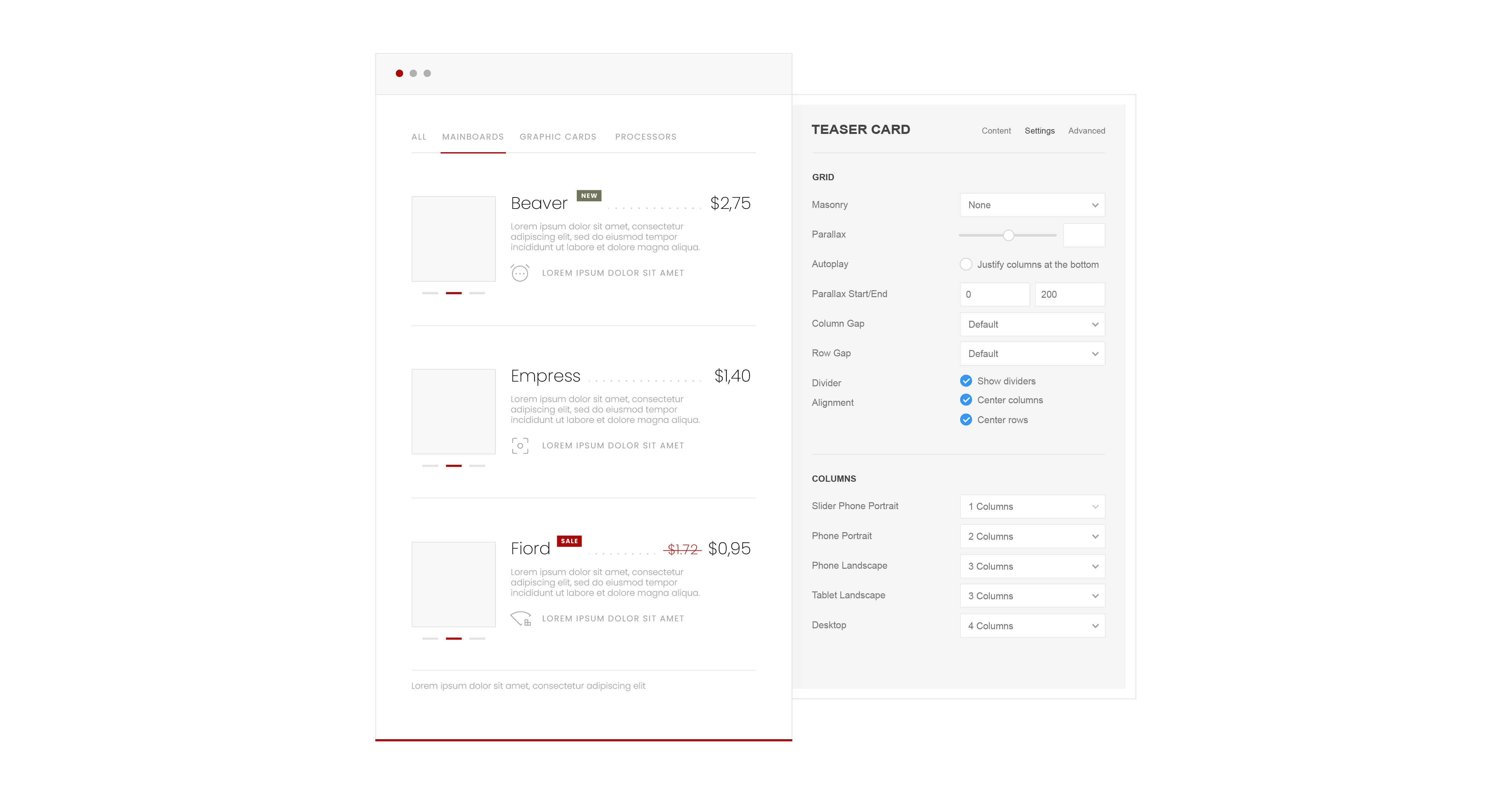
Element Settings
The wide range of settings variations, will give you ability to make element design looking professional and modern. Unleash your creativity and be unique.
If you have good ideas and improvements to this element, please request a feature in our Discord channel. User feedback is very important to us. We plan to make future updates based on our customers requests.

-
Vertical Align: Top, Bottom,Middle.
-
Fill Character: Dots, Dashes, Underscore.
-
Fill Leader with a characters: Yes/No.

-
Slider Animation
-
Slider Navigation
-
Slider Slidenav

-
Masonry Grid: Yes/No.
-
Parallax Effect: Number.
-
Column Gap: Small, Medium, Default, Large, None.
-
Row Gap: Small, Medium, Default, Large, None.
-
Dividers: Yes/No.
-
Center Columns: Yes/No.
-
Center Rows: Yes/No.

-
Phone Portrait Slider: 100%, 83%, 80%, 60%, 50%, auto.
-
Phone Portrait: 1-6 Column, Auto.
-
Phone Landscape: 1-6 Column, Auto.
-
Tablet Landscape: 1-6 Column, Auto.
-
Desktop: 1-6 Column, Auto.
-
Large Screen: 1-6 Column, Auto.

-
Style: Default, Primary, Secondary, Hover.
-
Link Panel: Yes/No. (disabled)
-
Add clipping offset: Yes/No.
-
Padding: Small, Default, Large.
-
Max Width: None, Small, Medium, Large, X-Large, 2X-Large.

-
Style: H1-H6, Lead, Small, Medium, Large, X-Large, 2X-Large, None.
-
Link Title: Yes/No.
-
Hover Style: Heading Link, Default Link.
-
Decoration: Bullet, Divider.
-
Font-Family: Default, Secondary, Tertiary.
-
Color: None, Muted, Default, Primary, Secondary, Success, Warning.
-
HTML Element: H1-H6, div.
-
Margin Top: Small, Default, Medium, Large, X-Large, None.

-
Style: H3-H6, Lead, Small, Meta, None.
-
Color: None, Muted, Default, Primary, Secondary, Success, Warning.
-
Decoration: Bullet, Divider.
-
Aligment: Below Title, Above Title, Below Content.
-
Margin Top: Small, Default, Medium, Large, X-Large, None.

-
Limit Content: Yes/No.
-
Characters: Number.
-
Position: Default, Below Attributes.
-
Style: Lead, Bold, Muted, Small None.
-
Color: None, Muted, Default, Primary, Secondary, Success, Warning.
-
Force left alignment: Yes/No.
-
Enable drop cap: Yes/No.
-
Remove Content HTML: Yes/No.
-
Display Short Content With Modal Enabled: Yes/No.
-
Columns: None, Halves, Thirds, Quarters, Fifths, Sixths.
-
Show dividers: Yes/No.
-
Margin Top: Small, Default, None.

-
Color: None, Muted, Default, Primary, Secondary, Success, Warning.
-
Style: Lead, Bold, Muted, Small, None.
-
Colon After Title: Yes/No.
-
Block Margin Top: Small, Default, Medium, Large, X-Large, None.
-
Text Margin Top: Number.
-
Alignment: Left, Center, Right.

-
Column Gap: Small, Medium, Default, Large, None.
-
Row Gap: Small, Medium, Default, Large, None.
-
Dividers: Yes/No.
-
Center Columns: Yes/No.
-
Center Rows: Yes/No.

Columns Settings: Phone Portrait, Phone Landscape, Tablet Landscape, Desktop, Large Screens.

Attributes Image Settings: All

Style: None, Muted, Text, Heading, Reset.

-
Position: Default, Above Title, Below Title, Above Content, Abowe Attributes, Below Attributes.
-
Style: H1-H6, Lead, Small, Meta, None.
-
Font Weight: Thin, Light, Default, Medium, Bold, Black.
-
Color: None, Muted, Default, Primary, Secondary, Success, Warning.
-
Currency Vertical Align: Unset, Baseline, Top, Bottom, Sub, Super.
-
Margin Top: Small, Default, Medium, Large, X-Large, None.

-
Padding: Number.
-
Align: Before Price, After Price.
-
Position: Above Price, Before Price.
-
Style: H3-H6, Lead, Small, Meta, None.
-
Color: None, Muted, Default, Primary, Secondary, Success, Warning.
-
Decoration: Line Through.
-
-
Margin Top: Small, Default, Medium, Large, X-Large, None.

-
Size: Number.
-
Color: None, Muted, Default, Primary, Secondary, Success, Warning.
-
Position: Left, Right.

-
Size: Small, Default, Large.
-
Border Radius: Number.
-
Position: Absolute, Before Title, After Title, Above Title, Below Title.
-
Absolute Origin: Left, Right.
-
Label Rotate: 90Deg, -90Deg
-
Top: Number.
-
Left: Number.
-
Right: Number.
-
Bottom: Number.
-
Margin Top: Small, Default, Medium, Large, X-Large, None.

-
Width/Height: Number.
-
Border: None, Rounded, Circle, Pill.
-
Box Shadow: Small, Medium, Large, X-Large.
-
Box Decoration: Default, Primary, Secondary, Shadow, Mask.
-
Link: Yes/No.
-
Hover Transition: None, Scale Up, Scale Down.
-
Hover Box Shadow: Small, Medium, Large, X-Large.
-
Icon Width: Number.
-
Icon Color: None, Default, Primary, Secondary, Success, Warning.
-
Alignment: Top, Bottom, Left, Right.
-
Grid Width: Auto, 20-80%.
-
Grid Column Gap: Small, Medium, Default, Large, None.
-
Grid Row Gap: Small, Medium, Default, Large, None.
-
Grid Breakpoint: Always, Phone, Tablet, Desktop.
-
Vertical Alignment Center: Yes/No.
-
Center Image: Yes/No.
-
Margin Top: Small, Default, Medium, Large, X-Large, None.
-
Inline SVG: Yes/No.
-
Animate SVG Stroke: Yes/No.
-
SVG Color: None, Default, Primary, Secondary, Success, Warning.

-
Button: Show, Hide.
-
Full Width: Yes/No.
-
Text: Field for enter the link text.
-
Style: Default, Primary, Secondary, Danger, Text, Link, Link Muted.
-
Button Size: Small, Default, Large.
-
Align: Left, Right, Center.
-
Margin Top: Small, Default, Medium, Large, X-Large, None.
-
Target: Open in a new window, Open in same window.
Thank You!
If you have any questions, please check out our FAQ page.


Teaser Card
Multifunctional pricing element
Do you need to quickly and easily create teasers, a restaurant menu with leaders, or other content with prices? With the Teaser Card Element for YOOtheme Pro Builder, you can effortlessly design captivating layouts and leverage its excellent features to showcase your content effectively.
-
Nested Grid
-
Nested Content
-
Slider
-
Filter
-
Lightbox
-
Rating
-
Modal
-
Grid Stack
-
Text Limit
-
Advanced Button
-
Visibility
-
Overriding
-
WCAG
-
Dynamic
-
Responsive
-
Falang


